

반응형
Color palette choices
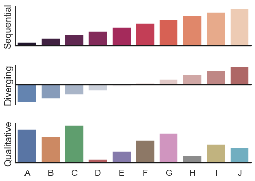
seaborn components used: set_theme(), barplot(), barplot(), barplot(), despine()
import numpy as np
import seaborn as sns
import matplotlib.pyplot as plt
sns.set_theme(style="white", context="talk")
rs = np.random.RandomState(8)

# Set up the matplotlib figure
f, (ax1, ax2, ax3) = plt.subplots(3, 1, figsize=(7, 5), sharex=True)

# Generate some sequential data
x = np.array(list("ABCDEFGHIJ"))
y1 = np.arange(1, 11)
sns.barplot(x=x, y=y1, palette="rocket", ax=ax1)
ax1.axhline(0, color="k", clip_on=False)
ax1.set_ylabel("Sequential")

# Center the data to make it diverging
y2 = y1 - 5.5
sns.barplot(x=x, y=y2, palette="vlag", ax=ax2)
ax2.axhline(0, color="k", clip_on=False)
ax2.set_ylabel("Diverging")

# Randomly reorder the data to make it qualitative
y3 = rs.choice(y1, len(y1), replace=False)
sns.barplot(x=x, y=y3, palette="deep", ax=ax3)
ax3.axhline(0, color="k", clip_on=False)
ax3.set_ylabel("Qualitative")

# Finalize the plot
sns.despine(bottom=True)
plt.setp(f.axes, yticks=[])
plt.tight_layout(h_pad=2)
Horizontal bar plots
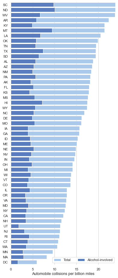
seaborn components used: set_theme(), load_dataset(), set_color_codes(), barplot(), set_color_codes(), barplot(), despine()
import seaborn as sns
import matplotlib.pyplot as plt
sns.set_theme(style="whitegrid")

# Initialize the matplotlib figure
f, ax = plt.subplots(figsize=(6, 15))

# Load the example car crash dataset
crashes = sns.load_dataset("car_crashes").sort_values("total", ascending=False)

# Plot the total crashes
sns.set_color_codes("pastel")
sns.barplot(x="total", y="abbrev", data=crashes,
            label="Total", color="b")

# Plot the crashes where alcohol was involved
sns.set_color_codes("muted")
sns.barplot(x="alcohol", y="abbrev", data=crashes,
            label="Alcohol-involved", color="b")

# Add a legend and informative axis label
ax.legend(ncol=2, loc="lower right", frameon=True)
ax.set(xlim=(0, 24), ylabel="",
       xlabel="Automobile collisions per billion miles")
sns.despine(left=True, bottom=True)
Grouped barplots
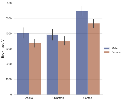
seaborn components used: set_theme(), load_dataset(), catplot()
import seaborn as sns
sns.set_theme(style="whitegrid")

penguins = sns.load_dataset("penguins")

# Draw a nested barplot by species and sex
g = sns.catplot(
    data=penguins, kind="bar",
    x="species", y="body_mass_g", hue="sex",
    ci="sd", palette="dark", alpha=.6, height=6
)
g.despine(left=True)
g.set_axis_labels("", "Body mass (g)")
g.legend.set_title("")
반응형