


반응형
Joint and marginal histograms
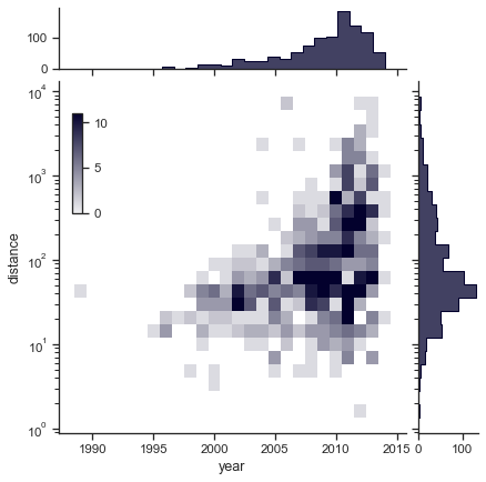
seaborn components used: set_theme(), load_dataset(), JointGrid
import seaborn as sns
sns.set_theme(style="ticks")

# Load the planets dataset and initialize the figure
planets = sns.load_dataset("planets")
g = sns.JointGrid(data=planets, x="year", y="distance", marginal_ticks=True)

# Set a log scaling on the y axis
g.ax_joint.set(yscale="log")

# Create an inset legend for the histogram colorbar
cax = g.figure.add_axes([.15, .55, .02, .2])

# Add the joint and marginal histogram plots
g.plot_joint(
    sns.histplot, discrete=(True, False),
    cmap="light:#03012d", pmax=.8, cbar=True, cbar_ax=cax
)
g.plot_marginals(sns.histplot, element="step", color="#03012d")
Hexbin plot with marginal distributions
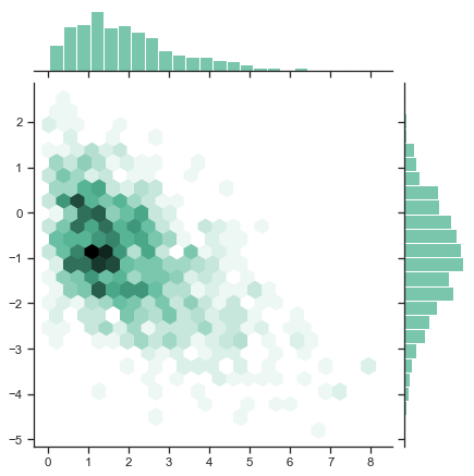
seaborn components used: set_theme(), jointplot()
import numpy as np
import seaborn as sns
sns.set_theme(style="ticks")

rs = np.random.RandomState(11)
x = rs.gamma(2, size=1000)
y = -.5 * x + rs.normal(size=1000)

sns.jointplot(x=x, y=y, kind="hex", color="#4CB391")
Scatterplot with marginal ticks
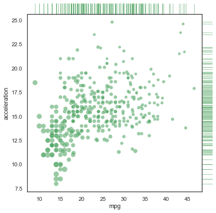
seaborn components used: set_theme(), load_dataset(), JointGrid
import seaborn as sns
sns.set_theme(style="white", color_codes=True)
mpg = sns.load_dataset("mpg")

# Use JointGrid directly to draw a custom plot
g = sns.JointGrid(data=mpg, x="mpg", y="acceleration", space=0, ratio=17)
g.plot_joint(sns.scatterplot, size=mpg["horsepower"], sizes=(30, 120),
             color="g", alpha=.6, legend=False)
g.plot_marginals(sns.rugplot, height=1, color="g", alpha=.6)
Smooth kernel density with marginal histograms
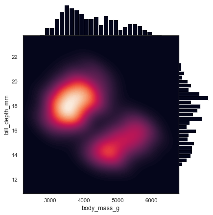
seaborn components used: set_theme(), load_dataset(), JointGrid
import seaborn as sns
sns.set_theme(style="white")

df = sns.load_dataset("penguins")

g = sns.JointGrid(data=df, x="body_mass_g", y="bill_depth_mm", space=0)
g.plot_joint(sns.kdeplot,
             fill=True, clip=((2200, 6800), (10, 25)),
             thresh=0, levels=100, cmap="rocket")
g.plot_marginals(sns.histplot, color="#03051A", alpha=1, bins=25)
Linear regression with marginal distributions
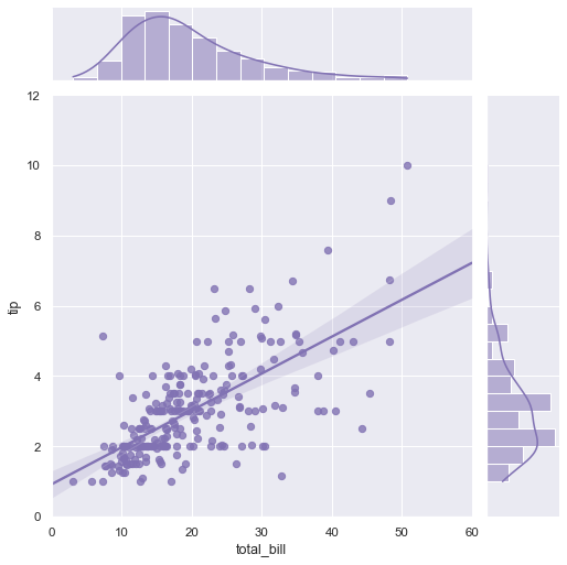
seaborn components used: set_theme(), load_dataset(), jointplot()
import seaborn as sns
sns.set_theme(style="darkgrid")

tips = sns.load_dataset("tips")
g = sns.jointplot(x="total_bill", y="tip", data=tips,
                  kind="reg", truncate=False,
                  xlim=(0, 60), ylim=(0, 12),
                  color="m", height=7)
Joint kernel density estimate
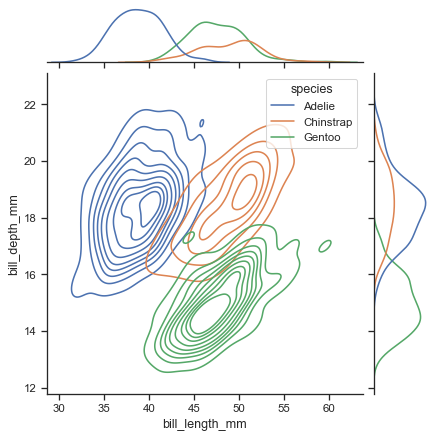
seaborn components used: set_theme(), load_dataset(), jointplot()
import seaborn as sns
sns.set_theme(style="ticks")

# Load the penguins dataset
penguins = sns.load_dataset("penguins")

# Show the joint distribution using kernel density estimation
g = sns.jointplot(
    data=penguins,
    x="bill_length_mm", y="bill_depth_mm", hue="species",
    kind="kde",
)
반응형