


반응형
Plotting on a large number of facets
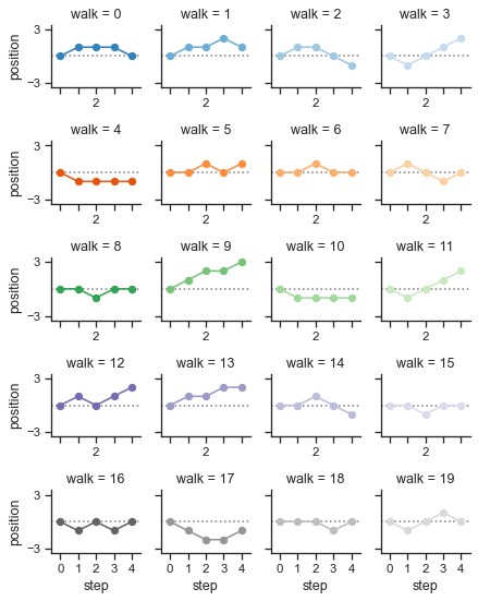
seaborn components used: set_theme(), FacetGrid
import numpy as np
import pandas as pd
import seaborn as sns
import matplotlib.pyplot as plt

sns.set_theme(style="ticks")

# Create a dataset with many short random walks
rs = np.random.RandomState(4)
pos = rs.randint(-1, 2, (20, 5)).cumsum(axis=1)
pos -= pos[:, 0, np.newaxis]
step = np.tile(range(5), 20)
walk = np.repeat(range(20), 5)
df = pd.DataFrame(np.c_[pos.flat, step, walk],
                  columns=["position", "step", "walk"])

# Initialize a grid of plots with an Axes for each walk
grid = sns.FacetGrid(df, col="walk", hue="walk", palette="tab20c",
                     col_wrap=4, height=1.5)

# Draw a horizontal line to show the starting point
grid.refline(y=0, linestyle=":")

# Draw a line plot to show the trajectory of each random walk
grid.map(plt.plot, "step", "position", marker="o")

# Adjust the tick positions and labels
grid.set(xticks=np.arange(5), yticks=[-3, 3],
         xlim=(-.5, 4.5), ylim=(-3.5, 3.5))

# Adjust the arrangement of the plots
grid.fig.tight_layout(w_pad=1)
FacetGrid with custom projection
seaborn components used: set_theme(), FacetGrid
import numpy as np
import pandas as pd
import seaborn as sns

sns.set_theme()

# Generate an example radial datast
r = np.linspace(0, 10, num=100)
df = pd.DataFrame({'r': r, 'slow': r, 'medium': 2 * r, 'fast': 4 * r})

# Convert the dataframe to long-form or "tidy" format
df = pd.melt(df, id_vars=['r'], var_name='speed', value_name='theta')

# Set up a grid of axes with a polar projection
g = sns.FacetGrid(df, col="speed", hue="speed",
                  subplot_kws=dict(projection='polar'), height=4.5,
                  sharex=False, sharey=False, despine=False)

# Draw a scatterplot onto each axes in the grid
g.map(sns.scatterplot, "theta", "r")
Overlapping densities (‘ridge plot’)
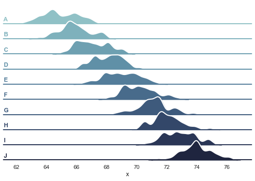
seaborn components used: set_theme(), cubehelix_palette(), FacetGrid
import numpy as np
import pandas as pd
import seaborn as sns
import matplotlib.pyplot as plt
sns.set_theme(style="white", rc={"axes.facecolor": (0, 0, 0, 0)})

# Create the data
rs = np.random.RandomState(1979)
x = rs.randn(500)
g = np.tile(list("ABCDEFGHIJ"), 50)
df = pd.DataFrame(dict(x=x, g=g))
m = df.g.map(ord)
df["x"] += m

# Initialize the FacetGrid object
pal = sns.cubehelix_palette(10, rot=-.25, light=.7)
g = sns.FacetGrid(df, row="g", hue="g", aspect=15, height=.5, palette=pal)

# Draw the densities in a few steps
g.map(sns.kdeplot, "x",
      bw_adjust=.5, clip_on=False,
      fill=True, alpha=1, linewidth=1.5)
g.map(sns.kdeplot, "x", clip_on=False, color="w", lw=2, bw_adjust=.5)

# passing color=None to refline() uses the hue mapping
g.refline(y=0, linewidth=2, linestyle="-", color=None, clip_on=False)


# Define and use a simple function to label the plot in axes coordinates
def label(x, color, label):
    ax = plt.gca()
    ax.text(0, .2, label, fontweight="bold", color=color,
            ha="left", va="center", transform=ax.transAxes)


g.map(label, "x")

# Set the subplots to overlap
g.figure.subplots_adjust(hspace=-.25)

# Remove axes details that don't play well with overlap
g.set_titles("")
g.set(yticks=[], ylabel="")
g.despine(bottom=True, left=True)
반응형