


반응형
Annotated heatmaps
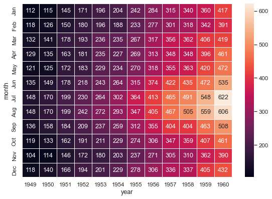
seaborn components used: set_theme(), load_dataset(), heatmap()
import matplotlib.pyplot as plt
import seaborn as sns
sns.set_theme()

# Load the example flights dataset and convert to long-form
flights_long = sns.load_dataset("flights")
flights = flights_long.pivot("month", "year", "passengers")

# Draw a heatmap with the numeric values in each cell
f, ax = plt.subplots(figsize=(9, 6))
sns.heatmap(flights, annot=True, fmt="d", linewidths=.5, ax=ax)
Plotting a diagonal correlation matrix
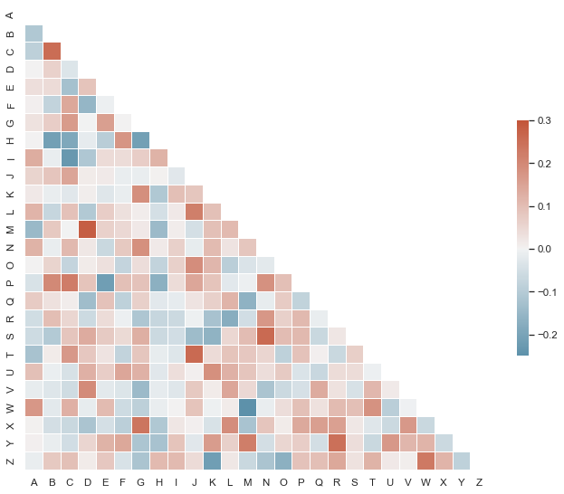
seaborn components used: set_theme(), diverging_palette(), heatmap()
from string import ascii_letters
import numpy as np
import pandas as pd
import seaborn as sns
import matplotlib.pyplot as plt

sns.set_theme(style="white")

# Generate a large random dataset
rs = np.random.RandomState(33)
d = pd.DataFrame(data=rs.normal(size=(100, 26)),
                 columns=list(ascii_letters[26:]))

# Compute the correlation matrix
corr = d.corr()

# Generate a mask for the upper triangle
mask = np.triu(np.ones_like(corr, dtype=bool))

# Set up the matplotlib figure
f, ax = plt.subplots(figsize=(11, 9))

# Generate a custom diverging colormap
cmap = sns.diverging_palette(230, 20, as_cmap=True)

# Draw the heatmap with the mask and correct aspect ratio
sns.heatmap(corr, mask=mask, cmap=cmap, vmax=.3, center=0,
            square=True, linewidths=.5, cbar_kws={"shrink": .5})
Scatterplot heatmap
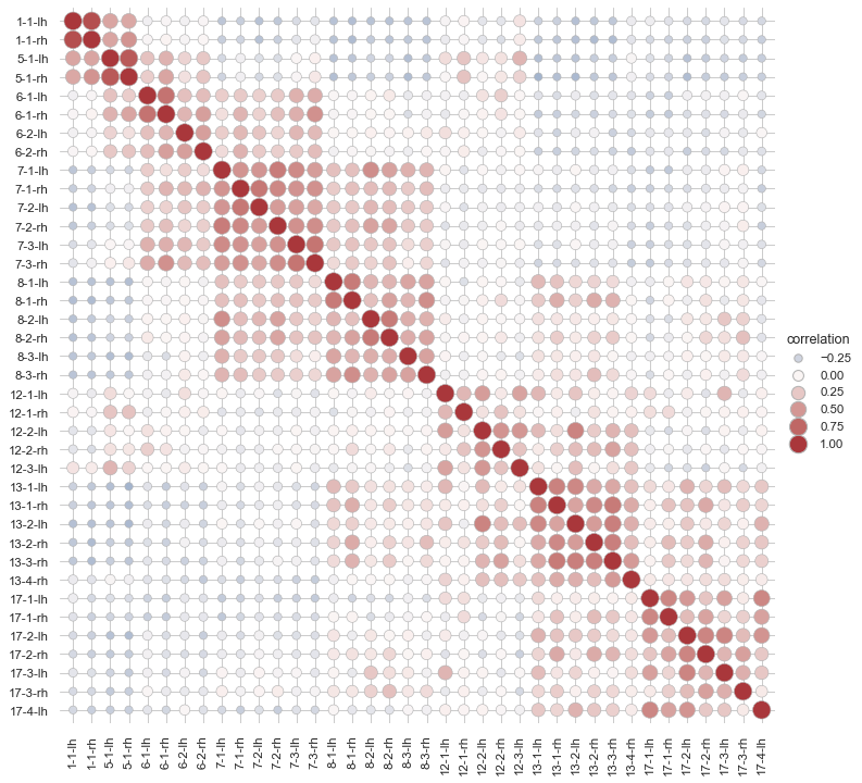
seaborn components used: set_theme(), load_dataset(), relplot()
import seaborn as sns
sns.set_theme(style="whitegrid")

# Load the brain networks dataset, select subset, and collapse the multi-index
df = sns.load_dataset("brain_networks", header=[0, 1, 2], index_col=0)

used_networks = [1, 5, 6, 7, 8, 12, 13, 17]
used_columns = (df.columns
                  .get_level_values("network")
                  .astype(int)
                  .isin(used_networks))
df = df.loc[:, used_columns]

df.columns = df.columns.map("-".join)

# Compute a correlation matrix and convert to long-form
corr_mat = df.corr().stack().reset_index(name="correlation")

# Draw each cell as a scatter point with varying size and color
g = sns.relplot(
    data=corr_mat,
    x="level_0", y="level_1", hue="correlation", size="correlation",
    palette="vlag", hue_norm=(-1, 1), edgecolor=".7",
    height=10, sizes=(50, 250), size_norm=(-.2, .8),
)

# Tweak the figure to finalize
g.set(xlabel="", ylabel="", aspect="equal")
g.despine(left=True, bottom=True)
g.ax.margins(.02)
for label in g.ax.get_xticklabels():
    label.set_rotation(90)
for artist in g.legend.legendHandles:
    artist.set_edgecolor(".7")
Discovering structure in heatmap data
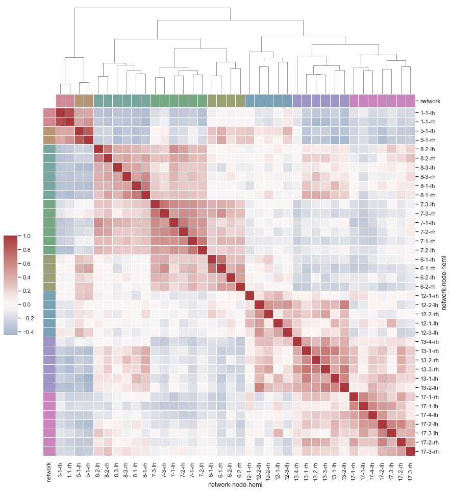
seaborn components used: set_theme(), load_dataset(), husl_palette(), clustermap()
import pandas as pd
import seaborn as sns
sns.set_theme()

# Load the brain networks example dataset
df = sns.load_dataset("brain_networks", header=[0, 1, 2], index_col=0)

# Select a subset of the networks
used_networks = [1, 5, 6, 7, 8, 12, 13, 17]
used_columns = (df.columns.get_level_values("network")
                          .astype(int)
                          .isin(used_networks))
df = df.loc[:, used_columns]

# Create a categorical palette to identify the networks
network_pal = sns.husl_palette(8, s=.45)
network_lut = dict(zip(map(str, used_networks), network_pal))

# Convert the palette to vectors that will be drawn on the side of the matrix
networks = df.columns.get_level_values("network")
network_colors = pd.Series(networks, index=df.columns).map(network_lut)

# Draw the full plot
g = sns.clustermap(df.corr(), center=0, cmap="vlag",
                   row_colors=network_colors, col_colors=network_colors,
                   dendrogram_ratio=(.1, .2),
                   cbar_pos=(.02, .32, .03, .2),
                   linewidths=.75, figsize=(12, 13))

g.ax_row_dendrogram.remove()
반응형