


반응형
Overview
이번 포스팅에서는 플로팅 액션 버튼을 이용하여 다이얼로그를 출력하고,
다이얼로그에서 내용을 입력하여 리스트뷰에 항목을 추가합니다.
이 포스팅은...
이전에 ListView 위젯을 이용하여 목록 표시를 구현하고,
StatefulWidget 위젯을 이용하여 실시간 검색 기능을 구현한 프로젝트를 기반으로 진행합니다.
ListView와 StatefulWidget에 대한 포스팅을 확인하시고 싶은 분은 아래의 링크를 확인해주세요.
- Flutter - ListView, Card - 스크롤 가능한 목록 표시, 목록 선택시 특정 목록 내용 보여주기
- Flutter - StatefulWidget 활용 - 실시간 검색 기능 구현하기
포스팅에서 사용된 예시 프로젝트 파일 다운로드
- 예시를 위한 프로젝트 파일은 깃허브에서 다운로드 가능합니다.
- '3_add_floating_action_button_example' 폴더를 확인해주세요.
- https://github.com/luvris2/flutter_memo_app
GitHub - luvris2/flutter_memo_app
Contribute to luvris2/flutter_memo_app development by creating an account on GitHub.
github.com
Floating Action Button
설명
- 앱 최상단에서 보이는 원형 아이콘 버튼으로 기본 작업을 수행
- 화면당 하나의 플로팅 작업 버튼 사용 가능
- 만들기, 공유, 탐색과 같은 긍정적인 작업에 주로 사용
- Scaffold 위젯 내에 위치
- 속성
- onPressed : 버튼을 눌렀을 때 호출되는 콜백 함수
- child : 버튼의 내용을 지정하는 위젯, 기본값 'Icon(Icons.add)'(추가 버튼)
- backgroudColor : 버튼의 배경색을 지정하는 속성
- foregroundColor : 버튼의 전경색을 지정하는 속성
- elevation : 버튼의 그림자 크기를 지정하는 속성, 기본값 6
- shape : 버튼의 모양을 지정하는 속성, 기본값 'CircleBorder()'
- heroTag : 애니메이션에서 사용하는 태그를 지정하는 속성, 기본값 null
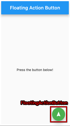
샘플 코드
플러터 가이드에 있는 샘플 코드입니다.
import 'package:flutter/material.dart';

void main() => runApp(const MyApp());

class MyApp extends StatelessWidget {
  const MyApp({super.key});

  @override
  Widget build(BuildContext context) {
    return const MaterialApp(
      home: FabExample(),
    );
  }
}

class FabExample extends StatelessWidget {
  const FabExample({super.key});

  @override
  Widget build(BuildContext context) {
    return Scaffold(
      appBar: AppBar(
        title: const Text('FloatingActionButton Sample'),
      ),
      body: const Center(child: Text('Press the button below!')),
      floatingActionButton: FloatingActionButton(
        onPressed: () {
          // Add your onPressed code here!
        },
        backgroundColor: Colors.green,
        child: const Icon(Icons.navigation),
      ),
    );
  }
}
showDialog
설명
- 사용자에게 모달 대화상자를 표시하는 기능을 제공하는 위젯
- 사용자의 액션을 기다린 후 적절한 대답을 할 수 있도록 앱의 흐름을 제어
- 속성
- context : 대화를 표시하는 데 사용되는 BuildContext
- builder : 대화 상자의 콘텐츠를 생성하는 데 사용되는 콜백, 이 콜백은 context, Navigator.pop 함수에 대한 액세스 권한이 있음
- barrierDismissible : 대화 상자의 바깥을 터치하면 대화 상자가 닫히도록 허용하는지의 여부 지정, 기본값 true
- barrierColor : 대화 상자 바깥의 색상 지정, 기본값 Colors.black54(검은색 투명도 54%)
- useSafeArea : 대화 상자가 SafeArea를 사용해야 하는지 여부 지정, 기본값 true
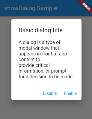
샘플 코드
플러터 가이드에 있는 샘플 코드입니다.
import 'package:flutter/material.dart';

void main() => runApp(const MyApp());

class MyApp extends StatelessWidget {
  const MyApp({super.key});

  @override
  Widget build(BuildContext context) {
    return const MaterialApp(
      home: DialogExample(),
    );
  }
}

class DialogExample extends StatelessWidget {
  const DialogExample({super.key});

  @override
  Widget build(BuildContext context) {
    return Scaffold(
      appBar: AppBar(title: const Text('showDialog Sample')),
      body: Center(
        child: OutlinedButton(
          onPressed: () => _dialogBuilder(context),
          child: const Text('Open Dialog'),
        ),
      ),
    );
  }

  Future<void> _dialogBuilder(BuildContext context) {
    return showDialog<void>(
      context: context,
      builder: (BuildContext context) {
        return AlertDialog(
          title: const Text('Basic dialog title'),
          content: const Text('A dialog is a type of modal window that\n'
              'appears in front of app content to\n'
              'provide critical information, or prompt\n'
              'for a decision to be made.'),
          actions: <Widget>[
            TextButton(
              style: TextButton.styleFrom(
                textStyle: Theme.of(context).textTheme.labelLarge,
              ),
              child: const Text('Disable'),
              onPressed: () {
                Navigator.of(context).pop();
              },
            ),
            TextButton(
              style: TextButton.styleFrom(
                textStyle: Theme.of(context).textTheme.labelLarge,
              ),
              child: const Text('Enable'),
              onPressed: () {
                Navigator.of(context).pop();
              },
            ),
          ],
        );
      },
    );
  }
}
설계 및 코딩
요구사항
- 플로팅 액션 버튼을 다이얼로그가 출력되어야 함
- 다이얼로그에서는 항목에 추가할 제목과 내용을 입력할 수 있어야 함
- 다이얼로그에서 '추가' 버튼을 누르면 제목과 내용이 항목에 추가될 수 있어야 함
코드 설계
FloatingActionButton
- Scaffold 내에 위치
- 클릭시 showDialog를 출력하기 위한 함수 호출
showDialog
- MyApp 클래스를 StatelessWidget으로 변경
- MyAppPage 클래스의 내용을 MeterialApp으로 감쌈
- MyAppPage 클래스를 StatefulWidget으로 상속하고 앱을 변경 가능 상태로 변경
- MyAppState 클래스에서 MyAppPage의 변경 가능한 상태를 상속 받음
- MyAppState 클래스에서 showDialog 코드 작성
import 'package:flutter/material.dart';
void main() {
runApp(MyApp());
}
class MyApp extends StatelessWidget {
const MyApp({super.key});
@override
Widget build(BuildContext context) {
return MaterialApp(
home: MyAppPage(),
);
}
}
// 앱의 상태를 변경해야하므로 StatefulWidget 상속
class MyAppPage extends StatefulWidget {
const MyAppPage({super.key});
@override
MyAppState createState() => MyAppState();
}
// 메인 클래스의 상태 상속
class MyAppState extends State<MyAppPage> {
// 검색어
String searchText = '';
// 리스트뷰에 표시할 내용
final List<String> items = ['Item 1', 'Item 2', 'Item 3', 'Item 4'];
final List<String> itemContents = [
'Item 1 Contents',
'Item 2 Contents',
'Item 3 Contents',
'Item 4 Contents'
];
// 플로팅 액션 버튼을 이용하여 항목을 추가할 제목과 내용
final TextEditingController titleController = TextEditingController();
final TextEditingController contentController = TextEditingController();
// 리스트뷰 카드 클릭 이벤트
void cardClickEvent(BuildContext context, int index) {
String content = itemContents[index];
Navigator.push(
context,
MaterialPageRoute(
// 정의한 ContentPage의 폼 호출
builder: (context) => ContentPage(content: content),
),
);
}
// 플로팅 액션 버튼 클릭 이벤트
Future<void> addItemEvent(BuildContext context) {
// 다이얼로그 폼 열기
return showDialog<void>(
context: context,
builder: (BuildContext context) {
return AlertDialog(
title: Text('항목 추가하기'),
content: Column(
mainAxisSize: MainAxisSize.min,
children: <Widget>[
TextField(
controller: titleController,
decoration: InputDecoration(
labelText: '제목',
),
),
TextField(
controller: contentController,
decoration: InputDecoration(
labelText: '내용',
),
),
],
),
actions: <Widget>[
TextButton(
child: Text('취소'),
onPressed: () {
Navigator.of(context).pop();
},
),
TextButton(
child: Text('추가'),
onPressed: () {
setState(() {
String title = titleController.text;
String content = contentController.text;
items.add(title);
itemContents.add(content);
});
Navigator.of(context).pop();
},
),
],
);
},
);
}
@override
Widget build(BuildContext context) {
return MaterialApp(
title: 'MemoApp', // 앱의 아이콘 이름
home: Scaffold(
appBar: AppBar(
centerTitle: true,
title: Text('Floating Acttion Button Example'), // 앱 상단바 설정
),
body: Column(
children: <Widget>[
Padding(
padding: const EdgeInsets.all(20.0),
child: TextField(
decoration: InputDecoration(
hintText: '검색어를 입력해주세요.',
border: OutlineInputBorder(),
),
onChanged: (value) {
setState(() {
searchText = value;
});
},
),
),
Expanded(
child: ListView.builder(
// items 변수에 저장되어 있는 모든 값 출력
itemCount: items.length,
itemBuilder: (BuildContext context, int index) {
// 검색 기능, 검색어가 있을 경우
if (searchText.isNotEmpty &&
!items[index]
.toLowerCase()
.contains(searchText.toLowerCase())) {
return SizedBox.shrink();
}
// 검색어가 없을 경우, 모든 항목 표시
else {
return Card(
elevation: 3,
shape: RoundedRectangleBorder(
borderRadius:
BorderRadius.all(Radius.elliptical(20, 20))),
child: ListTile(
title: Text(items[index]),
onTap: () => cardClickEvent(context, index),
),
);
}
},
),
),
],
),
// 플로팅 액션 버튼
floatingActionButton: FloatingActionButton(
onPressed: () => addItemEvent(context), // 버튼을 누를 경우
tooltip: 'Add Item', // 플로팅 액션 버튼 설명
child: Icon(Icons.add), // + 모양 아이콘 ),
),
),
);
}
}
// 선택한 항목의 내용을 보여주는 추가 페이지
class ContentPage extends StatelessWidget {
final String content;
const ContentPage({Key? key, required this.content}) : super(key: key);
@override
Widget build(BuildContext context) {
return Scaffold(
appBar: AppBar(
title: Text('Content'),
),
body: Center(
child: Text(content),
),
);
}
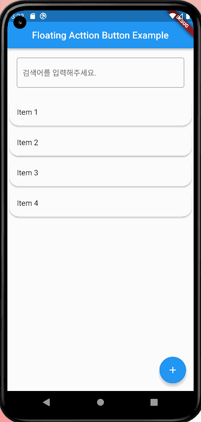
}실행 화면
참고
반응형